
Note: This post belongs to a long series whose summary is here and which aims to present you how to use the CCControl library.
In this part we will see how to create and work with a CCControlPicker which is an implementation of a picker for Cocos2D. A picker is a control that use a spinning-wheel or slot-machine metaphor to show one set of values.
CCControlPicker
A CCControlpicker is composed of several elements as shown below:
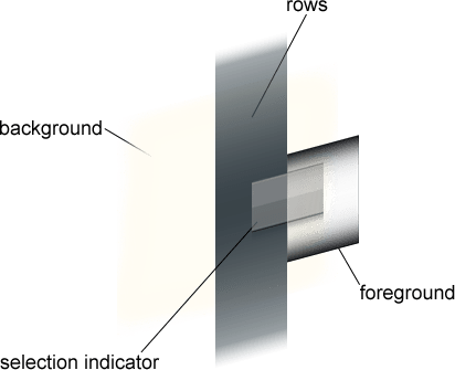
These components are:
- A background which is a CCNode so you can customize it as you which
- The rows which are a list of CCNode which respect the CCControlPickerRowDelegate. They can be seen as the cells of TableViews, and they are the visual representation of each rows
- A selection indicator sprite to visualize the location of the selection
- A foreground sprite which scissors the view to its bounds. It means that all the components (background, selection indicator, rows) which are out the foreground bounds are not displayed
In the next section we are going to talk about the code and more specifically how to create a CCControlPicker, how it works and its possible configurations.
Default Behavior
The simplest way to create a picker is to define its foreground and selection indicator sprite names at the initialization:
// Create a picker
CCControlPicker *picker  = [CCControlPicker pickerWithForegroundFile:@"pickerBackground.png"
                                                       selectionFile:@"pickerSelection.png"];
By default when you create a picker there is no rows, no delegates to set, no background (by default the background is transparent). Unfortunately with this code your picker will do nothing because it miss the most important part, the delegates. So now let’s go to the picker’s core.
Working with the Delegates
The CCControlPicker is inspired from the UIPickerView and UITableView principles. It needs you implements some methods to populate/indicate what to display and how/what to do with the content. To do so the first thing to do is to tell you interface to implement the CCControlPickerDelegate and the CCControlPickerDataSource and to inquire it at your picker:
// Into your interface
@interface YourClass <CCControlPickerDataSource , CCControlPickerDelegate>

// Into your controller
picker.dataSource           = self;
picker.delegate             = self;
So let’s go into the details.
CCControlPickerDataSource
The CCControlPickerDataSource protocol must be adopted by an object that mediates between a CCControlPicker object and your application’s data model for that control picker. The data source provides the control picker with the number of components, and the number of rows in the component, for displaying the picker data:
// Called by the picker control when it needs the number of rows
- (NSUInteger)numberOfRowsInControlPicker:(CCControlPicker *)controlPicker
{
    return [_source count];
}

// Called by the picker control when it needs the node to use for a given row
- (CCControlPickerRow *)controlPicker:(CCControlPicker *)controlPicker nodeForRow:(NSUInteger)row
{
    // Create a row node
    CCControlPickerRow *rowNode = [CCControlPickerRow node];
    // Populate it using your source
    rowNode.textLabel.string    = [_source objectAtIndex:row];

    return rowNode;
}
CCControlPickerDelegate
The CCControlPickerDelegate protocol provides optional methods to respond to selections or deselections of component rows and to defines the size that each row must adopt:
// Called by the control picker when it needs the row size to use for drawing row content
- (CGSize)rowSizeForControlPicker:(CCControlPicker *)controlPicker
{
    return CGSizeMake(35, 45);
}

// Called by the control picker when the user selects a row
- (void)controlPicker:(CCControlPicker *)controlPicker didSelectRow:(NSUInteger)row
{
    NSLog(@"Selection node[%d] = %@", row, [_source objectAtIndex:row]);
}
CCControlPickerRow
A row node implements some methods and callbacks from the CCControlPickerRowDelegate to make the CCControlPicker customization more easier. Each row can respond to some events sent by the picker such as rowDidHighlighted or rowDidSelected for example, thereby making rows more lively .
Now we have seen the main functions of the CCControlPicker we are going to talk about its own properties.
Properties
The CCControlPicker is built with a set of properties which are listed below:
- background: a CCNode to customize the picker’s background
- swipeOrientation: defines the orientation on which the picker can move and the swipe direction which is allowed (Vertical or Horizontal)
- looping: defines whether the picker’s can loop (i.e defines if when the last data source element is displayed which go to the beginning or not)
- selectedRow: contains the current selected row(you can animating the change of the selected row by calling the setRow:animated: method anyway)
Where To Go From Here?
To conclude the CCControlPicker is very similar to the UIPickerView class (from CocoaTouch). It is very useful when you need to select an element for a long list into option menus for example.
You can find the code source and the examples on github and the API documentation hosted here.
If you have any comments or questions about this article or the component, don’t hesitate to post a comment!
 (1 votes, average: 5.00 out of 5)
 Loading...


